|
|
Post by Ztrl on Apr 21, 2008 12:59:33 GMT -5
Keep up the good work MoX
|
|
|
|
Post by MasterOmegaX on Oct 19, 2008 21:52:33 GMT -5
|
|
|
|
Post by Nightmare on Oct 19, 2008 22:23:02 GMT -5
Wow. Purdy. Real professional looking. =O
We don't see enough of you nowdays, post some new stuff when you get the chance. =D
|
|
|
|
Post by Professor Fann on Oct 20, 2008 11:17:31 GMT -5
Hey, it's the MoX. Welcome back. Been so long.
That is truly sleek and professional looking. Great awesome job.
|
|
|
|
Post by Ruinaru on Oct 20, 2008 12:04:55 GMT -5
Well... The design is cool, but the colors could use some work... It's a little harsh on the eyes as it is, and some of the text is hard to distinguish from the design.
Good design, but maybe add some darker colors in there or something...
|
|
|
|
Post by Professor Fann on Oct 21, 2008 21:36:04 GMT -5
It's just good as it is simple.
Welcome back, once again, MoX.
|
|
|
|
Post by Ruinaru on Oct 21, 2008 22:45:59 GMT -5
I'm just saying, it's a bit too bright for my eyes. If you like it, that's fine.
|
|
|
|
Post by MasterOmegaX on Mar 12, 2009 22:23:04 GMT -5
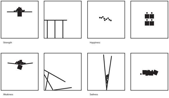  It doesn't look impressive but this was a composition practice I did, I was supposed to only use black and white colors, and circles, squares, and lines to describe Strength/Weakness, Happiness/Sadness, Stress/Lazy, and Natural/Artificial. At first I thought it was easy but it was harder than it looked. It was fun to play around with and I'm really starting to appreciate graphic design more. Last January as an assignment for my Graphics class I was supposed to create a logo for the Dinosaur Dash, which is a marathon jogging event thats been around for awhile in my area. On Monday I had a pretty boring day, but at last period they announced that my logo won and gave me a $100 so that made me really happy. I don't care about the money as much as I do about the fact that the logo will be on a bunch of shirts and posters though. I like the work I've done on the logo despite the sloppy pen tool work.  |
|
|
|
Post by Professor Fann on Mar 12, 2009 23:48:24 GMT -5
I don't get the composition work, but this logo work is awesome. A dinosaur, two people and an old grandma. Ha hah.
|
|
|
|
Post by MasterOmegaX on Mar 13, 2009 0:27:38 GMT -5
"I was supposed to only use black and white colors, and circles, squares, and lines to describe Strength/Weakness, Happiness/Sadness, Stress/Lazy, and Natural/Artificial"
Basicly the practice involved me to use only three shapes to describe these pairs of comparisons. If anyone likes graphic design this is a nice activity to try atleast once; it's a good practice for expressing a message through visuals, which is what graphic design is about.
|
|
|
|
Post by Professor Fann on Mar 14, 2009 10:53:46 GMT -5
"I was supposed to only use black and white colors, and circles, squares, and lines to describe Strength/Weakness, Happiness/Sadness, Stress/Lazy, and Natural/Artificial" Yes, I know that. It's just I don't really know how lines and circles can fully represent such feelings and incidences. Probably I need to read more on this topic. |
|
|
|
Post by MasterOmegaX on Mar 15, 2009 2:42:30 GMT -5
"supposed to only use black and white colors, and circles, squares, and lines"
Like I said it's a practice; it's easier to create a message by free hand drawing but what makes this practice good is that you're limited to three shapes and black and white, meaning you have to be a bit more creative in creating your message.
One could easily draw a certain emotion but that isn't the point; the point is to practice using what you have. This also helps you concentrate on creativity more than technique.
I'll just say this again though, that it was just a fun practice I did that lets you focus more on playing around with composition.
|
|