|
|
Post by Rhonoc on Dec 31, 2008 13:23:49 GMT -5
I hope the contest goes well for you!
|
|
aritheo
Full Member
   [A:0]�
Member is offline
ZV's friendly neighborhood lesbian.
Posts: 107
|
Post by aritheo on Jan 6, 2009 21:31:09 GMT -5
Lovely coloring on the last picture. And I like the perspective with the walkway disappearing into the background.
|
|
|
|
Post by Albireo on Jan 17, 2009 19:33:07 GMT -5
Two new ones >_> 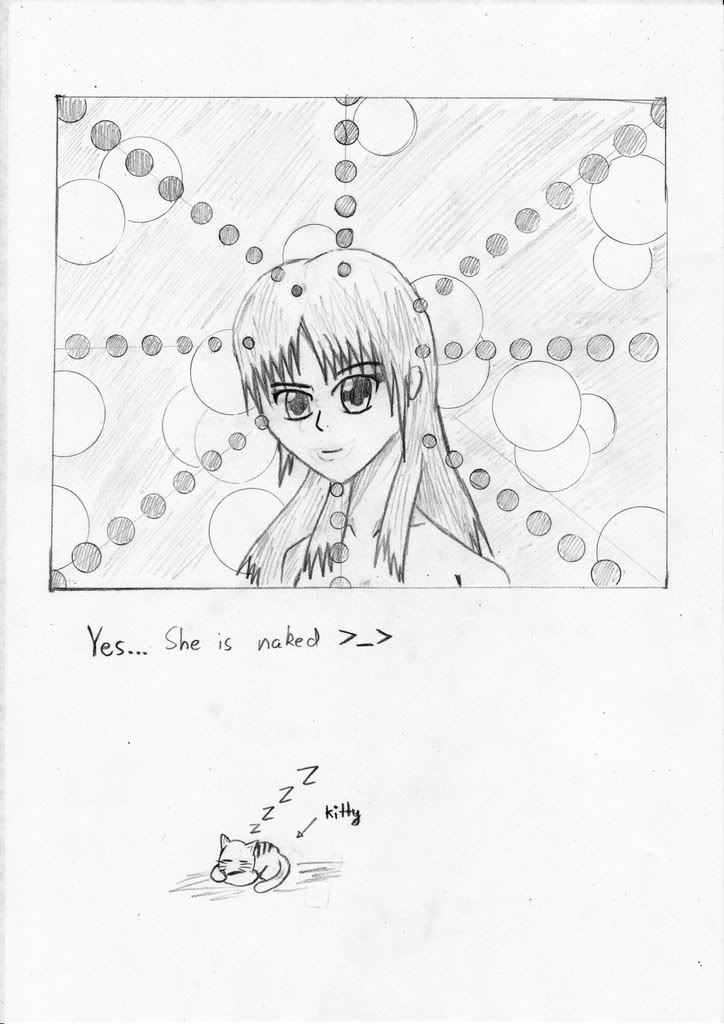 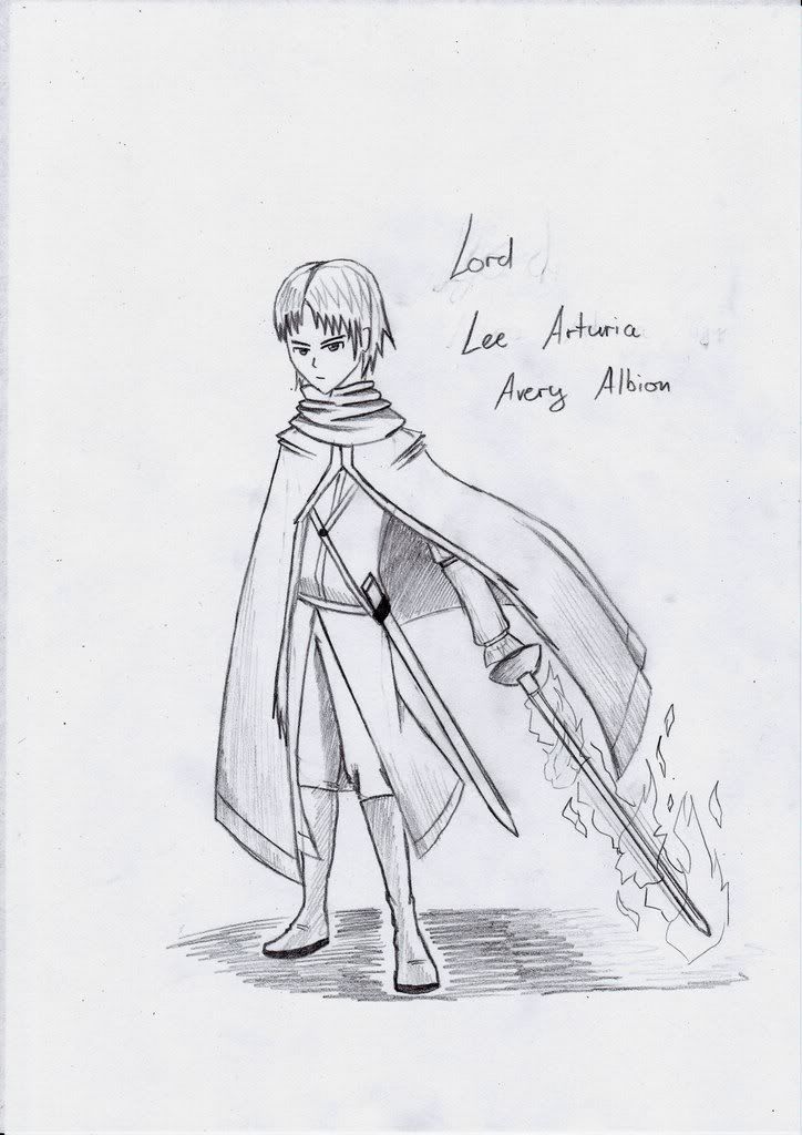 |
|
|
|
Post by Nightmare on Jan 18, 2009 1:04:47 GMT -5
lawl, nekkid
I really like the design on the guy in that second picture. =O
Good job, keep it up.
|
|
|
|
Post by Rhonoc on Jan 18, 2009 2:34:41 GMT -5
Woohooo!
Naked!!
Still really good.
And it may be me, but I think the cloak should have a fold or two more. It's too straight in my opinion!!
Still, really good.
|
|
|
|
Post by Albireo on Jan 19, 2009 1:51:45 GMT -5
Some random line-work I used my nibs for this, and it came out quite well for my first time 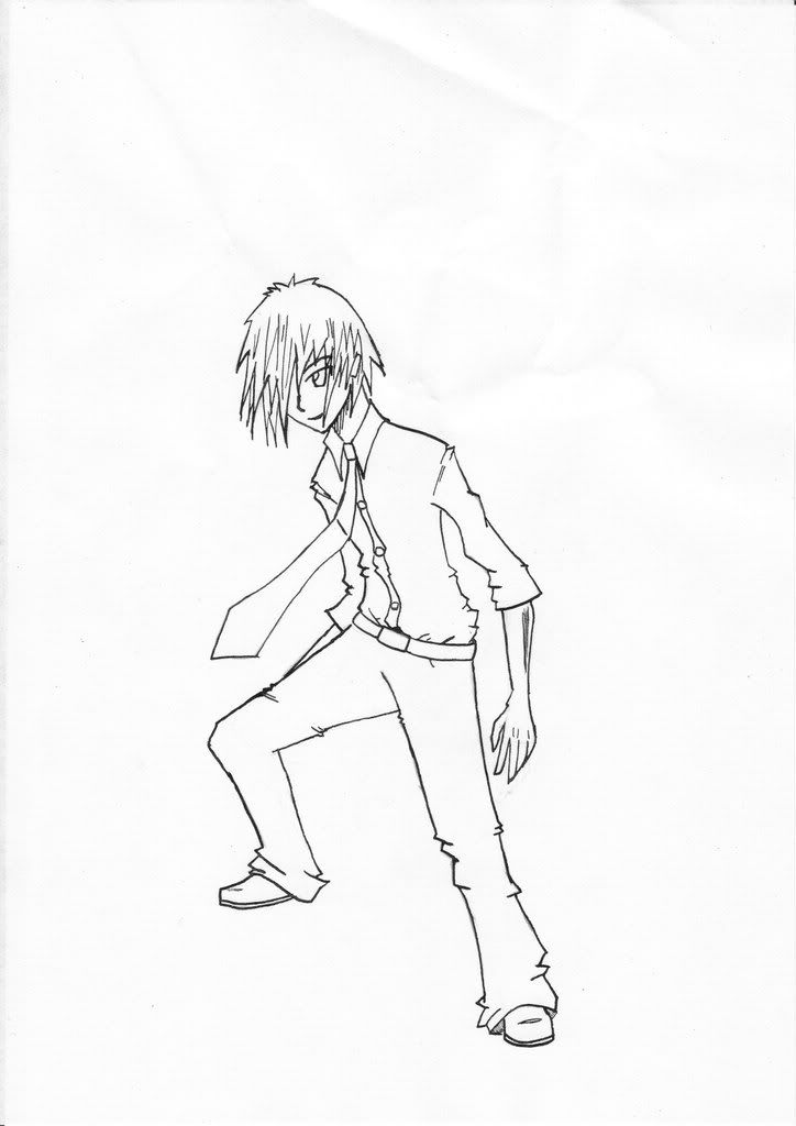 |
|
|
|
Post by Albireo on Jan 19, 2009 20:45:10 GMT -5
And some more 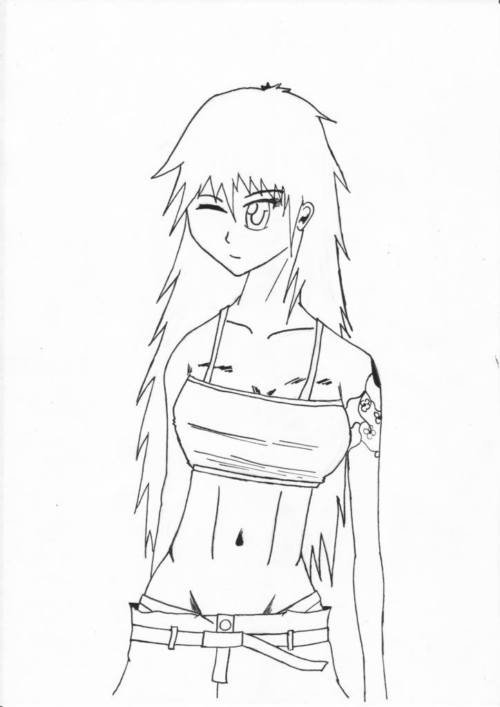 |
|
|
|
Post by Albireo on Jan 20, 2009 19:17:24 GMT -5
And another one 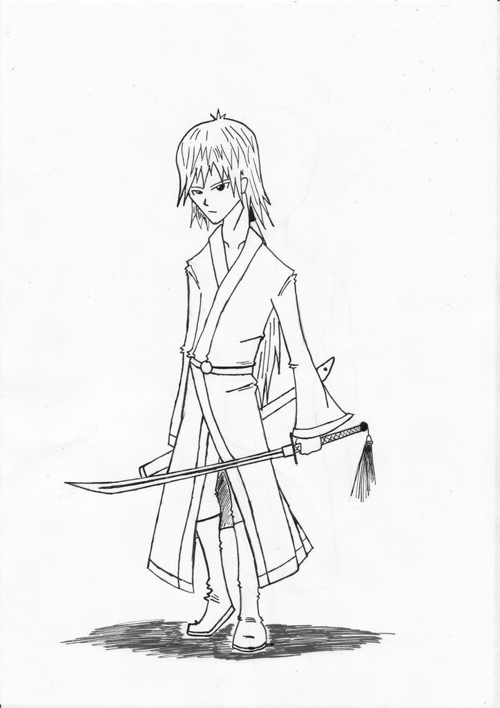 |
|
|
|
Post by Renegade on Jan 20, 2009 23:45:39 GMT -5
Im digging the woman's design her stomach looks a little odd though.. maybe its the belly button maybe its the abbs.. I dont know, but the outfit is quite alluring so your going on the right track  |
|
|
|
Post by Albireo on Jan 21, 2009 0:16:54 GMT -5
hehe... It was originally a doodle, but then I inked it
Now I'm gonna look back at that book, for stuff taht I may be missing
|
|
|
|
Post by Professor Fann on Jan 21, 2009 13:22:08 GMT -5
Ya know, I've gotten the feelings you've finally produced some nice-looking ladies here that do not look like men's faces at all! Congratulations! And that's noteworhty coming from me - me always asking you to improves on the ladies' faces and not kill them off as men's.
The guys are good now, the second one strikes me the most as a dangerous student, and that's awesome. But legs being longer a little makes him perfect.
|
|
|
|
Post by Albireo on Jan 22, 2009 4:23:41 GMT -5
New one And thanks for the comments 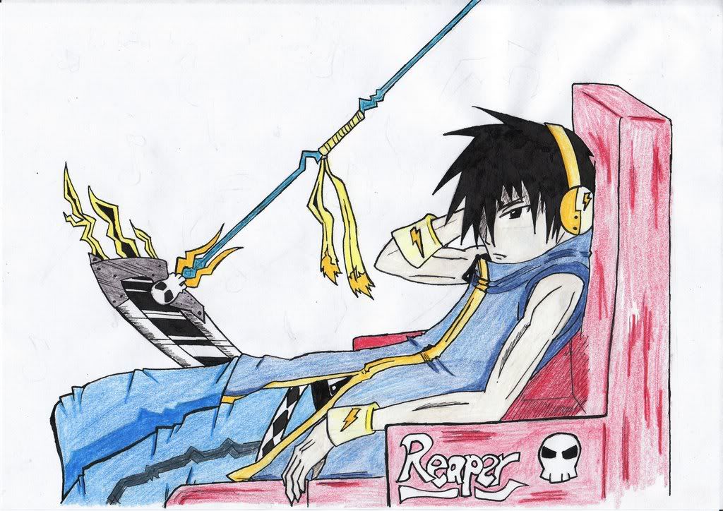 |
|
|
|
Post by Professor Fann on Jan 24, 2009 1:04:33 GMT -5
Awesome colouring. Just the arms a wee bit too thin, me thinks.
|
|
|
|
Post by Nightmare on Jan 24, 2009 1:09:00 GMT -5
I think the arms look fine as far as thickness goes. I wouldn't go overboard with the lines to try and define muscle though. Since it doesn't look like he has much. XP
|
|
|
|
Post by Rhonoc on Jan 24, 2009 6:05:06 GMT -5
Nice!!!
Awsome drawing.
I really like the scythe.
And like Nightmare said, don't put too much lines on the hands.
But otherwise, it looks really cool.
|
|