|
|
Post by Professor Fann on May 26, 2009 21:59:10 GMT -5
Windflower art is strangely slightly more improved than your previous arts on the ladies and ... improve on them backgrounds of the citeh.
|
|
|
|
Post by Albireo on May 27, 2009 6:14:30 GMT -5
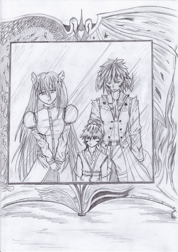
As for backgrounds I've only just started practicing them, so for now it's only basic looking buildings. Distorted angle was due to my liking for distorted angles. Anyways, something in pencil for a contest  |
|
|
|
Post by Albireo on May 29, 2009 9:50:02 GMT -5
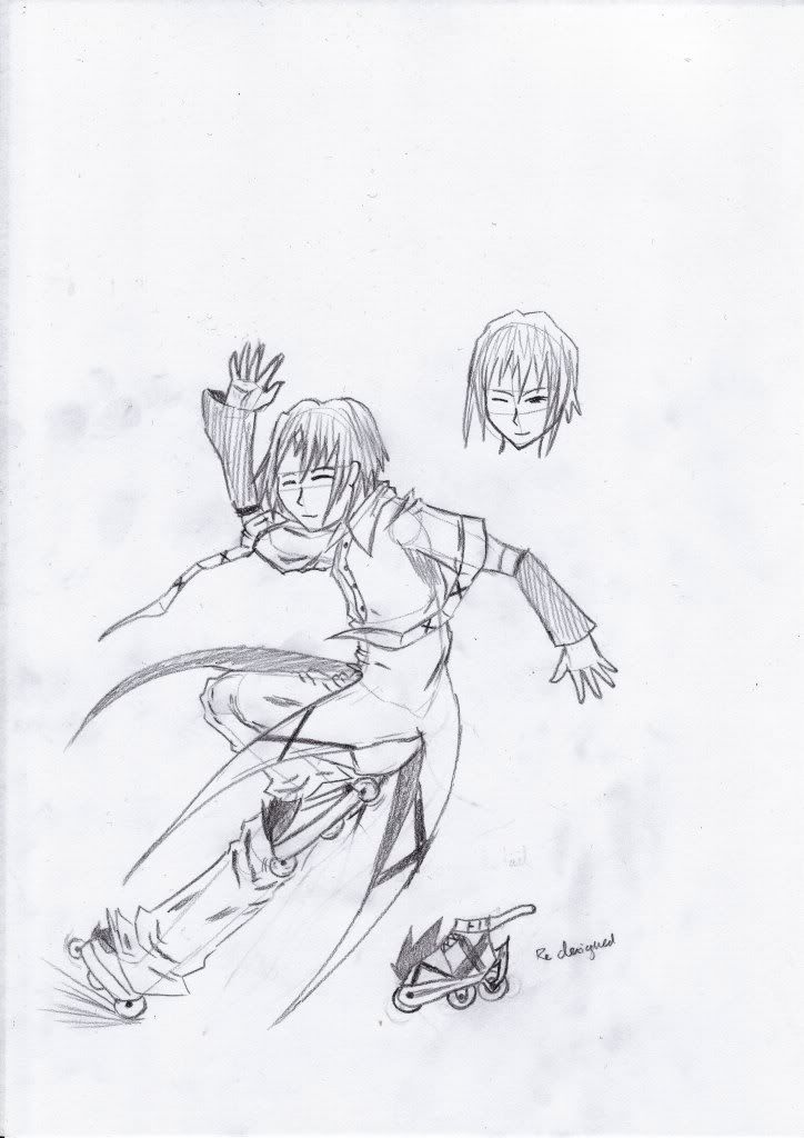
Character idea quicky  |
|
|
|
Post by Professor Fann on May 31, 2009 10:54:46 GMT -5
Well, I can say that you've done well for man and woman arts. Now I feel you must practise for children, both boys and girls.
Second art is not so pleasing.
Go on and be an all-rounder.
|
|
|
|
Post by Albireo on Jun 1, 2009 1:28:20 GMT -5
Well it's just a quicky
Practising for children will be done soon, after I learn to draw from different angles
|
|
|
|
Post by Albireo on Jun 27, 2009 5:10:55 GMT -5
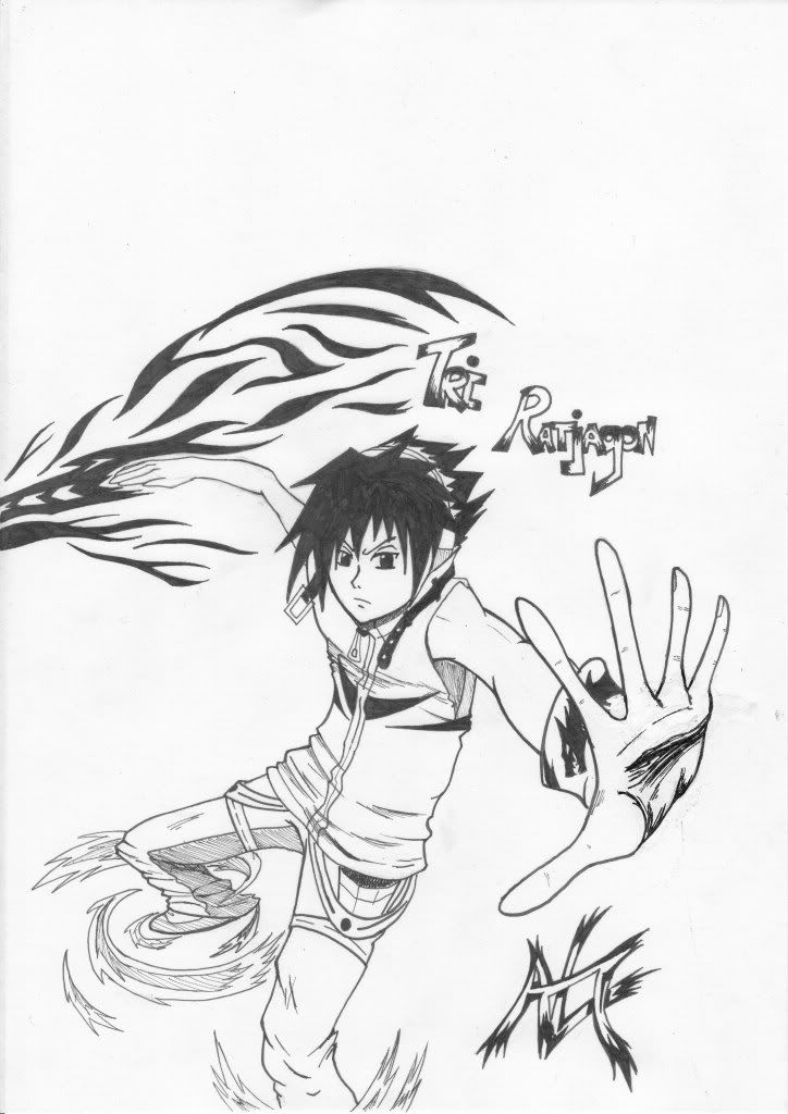
And after a long time I procure something >_> Drew this on mah folder cos I got bored, then suddenly I inked it...  |
|
|
|
Post by Nightmare on Jun 27, 2009 5:22:57 GMT -5
I gotta say this is probably one of your better ones. I like the attention to detail on even the small stuff (I envy the way you draw buckles XD)
Good work Al. Keep it up. =O
|
|
|
|
Post by Professor Fann on Jun 27, 2009 9:41:17 GMT -5
Ah, I concur. For once you've conjured your most perfect art.
|
|
|
|
Post by HZ on Jun 27, 2009 17:35:28 GMT -5
Looks awesome, Al.
I agree with Nightmare, I like how you put a lot attention to detail in the pic, and the style of it is great.
Keep it up, I look forward to see what you do next. =D
|
|
|
|
Post by Albireo on Jul 6, 2009 5:58:27 GMT -5
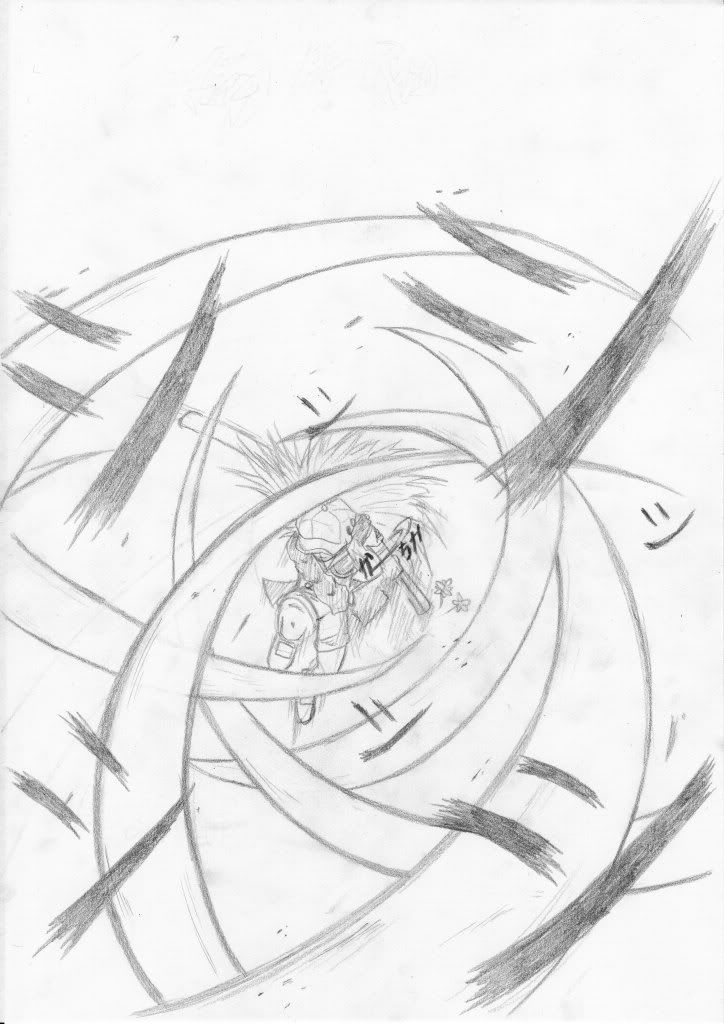
Two new ones One I was about to discard since the hand didn't seem right, but I inked it before I saw the mistake. Effort seemed to hard to waste and throw away.  And this one is incomplete  |
|
|
|
Post by Professor Fann on Jul 7, 2009 6:38:14 GMT -5
Hmm ... you're right. In the first art, the forearm is scarily thinner than average. But overall, since youve pointed that out, plus you've made good efforts into that piece, it's thus good overall.
Well, this second art is incomplete, but it sure does look impressive. Wonderful.
|
|
swimstud600
Guest
Member is offline
|
Post by swimstud600 on Jul 7, 2009 17:20:12 GMT -5
Can't wait to see the completed version, it looks badass.
|
|
|
|
Post by Albireo on Jul 17, 2009 5:34:11 GMT -5
SO MANY MISTAKES D: *accident on the left hand caused a forced mistake* Also about the incomplete one before, I haven't had the time to get it onto bleed proof paper, and I'm too lazy to do so, so I'm gonna do it with normal inking pens. I used Dip pens for the one below Crossover of Dante and Sho, if I'd thought of this combination earlier, this might've been my entry to the Carnival contest  |
|
|
|
Post by Professor Fann on Jul 17, 2009 11:56:31 GMT -5
This art just looks a whole lot awesome. Maybe that bullet doesn't need its smoke ... that the bullet is present there should alone mean that he's firing the gun.
|
|
|
|
Post by Albireo on Jul 18, 2009 6:57:13 GMT -5
I got bored and did this =D Improper paper for copics though D:  |
|