Ultima
Member
 Member is offline
i'll crush you!
Posts: 68
|
Post by Ultima on Mar 16, 2006 19:39:25 GMT -5
|
|
sevi
Guest
Member is offline
|
Post by sevi on Mar 17, 2006 9:57:40 GMT -5
Aw, comon'! Show us what you can REALLY do. I know you're just toying with them, partner. Anyway, they're still good.
|
|
Ultima
Member
Member is offline
i'll crush you!
Posts: 68
|
Post by Ultima on Mar 17, 2006 14:18:21 GMT -5
hey!quiet!i was gonna surprise them
|
|
sevi
Guest
Member is offline
|
Post by sevi on Mar 17, 2006 14:29:03 GMT -5
hey!quiet!i was gonna surprise them I just want to make sure they don't underestimate you, partner. |
|
Ultima
Member
Member is offline
i'll crush you!
Posts: 68
|
Post by Ultima on Mar 20, 2006 14:44:37 GMT -5
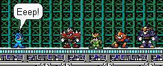
Well i promised you a new sprite but....i made 8 yeah i had some extra time anyway here they are  not even close to done |
|
|
|
Post by Andrew on Mar 20, 2006 16:55:13 GMT -5
Shading on the wizard's robe is horrible, it looks like it's just an outline shade and then a lighter one inside. And that's it. It probably is it too.
The gold is eye-searing, dim that down a bit, you can't see the details.
The ninja looks like he's all outline and one color inside, with not detail on him at all. If there is any.
The knight works, I guess. At least you edited the chest.
Also, do they all have the same barber?
-Haruchine
|
|
Ultima
Member
Member is offline
i'll crush you!
Posts: 68
|
Post by Ultima on Mar 24, 2006 1:17:33 GMT -5
ow bad first review not a good start but anyway: yes the wizards shading is pretty bad but that was my first time ever trying to make a robe the gold searing i'll make it a bit dimmer the ninja i added a face mask a belt and a headband and the barber thing it's supposed to be the same person switching anyway heres some conversions i made   |
|
|
|
Post by ZeroX on Mar 24, 2006 12:34:00 GMT -5
I dont know what your friend is talking about. these are c- works at best. You can tell the base a mile away with all those sprites and the shading on this last one you made to look like blues looks like Zero with a scarf?
|
|
Ultima
Member
Member is offline
i'll crush you!
Posts: 68
|
Post by Ultima on Mar 26, 2006 2:19:27 GMT -5
He must have been drinking.....or he hadn't been to any major spriting boards before anyway.....I admit i did horrible on the protoman one and making the base apparent was intentional anyway how about this one is it any better?  |
|
|
|
Post by Captain SpExtacular on Mar 26, 2006 13:55:39 GMT -5
Thats better than the other stuff ill say that.
|
|
Ultima
Member
Member is offline
i'll crush you!
Posts: 68
|
Post by Ultima on Mar 30, 2006 20:50:40 GMT -5
|
|
|
|
Post by Nicktendonick on Mar 31, 2006 0:00:32 GMT -5
oooohhh, not bad sprites there. I like the Gif animation too.
Yet, I think there might be something with the shading. Something about the shading doesn't look good
|
|
Ultima
Member
Member is offline
i'll crush you!
Posts: 68
|
Post by Ultima on Mar 31, 2006 15:57:52 GMT -5
on the first and second ones right?and on the gold trim a bit.....i'll have it fixed by tonight
|
|
sevi
Guest
Member is offline
|
Post by sevi on Mar 31, 2006 22:59:56 GMT -5
how about these better or worse?     1000X better. Just keep doing that. |
|
|
|
Post by Nightmare on Mar 31, 2006 23:05:09 GMT -5
They can all use a little work. I'd say try working on the contrast, the hair especially has contrast issues.
But other than that, pretty good, keep at it.
|
|