|
|
Post by Professor Fann on Oct 17, 2008 8:29:03 GMT -5
Nice one as well. I like them inked always.
I don't really like the emotionless face ... it gives the still bad-villain look. I think. If he's a good guy though, he should have that look of determination, not being still and stiff like a log.
|
|
|
|
Post by Albireo on Oct 17, 2008 21:14:35 GMT -5
It's always nice to break stereotypes in my opinion D:
EDIT: I also made an evil adaption for him in an RP someplace else... So probably, he might be evil
But he's also gonna be the main character, of a story I have in my head... Might turn evil at the end D:
|
|
|
|
Post by Professor Fann on Oct 18, 2008 20:06:19 GMT -5
Hmm ... confused or undecided, ye are.
I await the next update.
|
|
|
|
Post by Sorrum on Oct 19, 2008 8:42:54 GMT -5
Holy crap Zanji, you got better while I wasn't looking.
|
|
|
|
Post by Professor Fann on Oct 19, 2008 20:49:17 GMT -5
I prefer to think of him as Albireo. His change of name was cool. Zanjitsu didn't sound nice and sporty to me.
|
|
|
|
Post by Albireo on Oct 24, 2008 6:54:35 GMT -5
T3h update haz beenz appeared D: 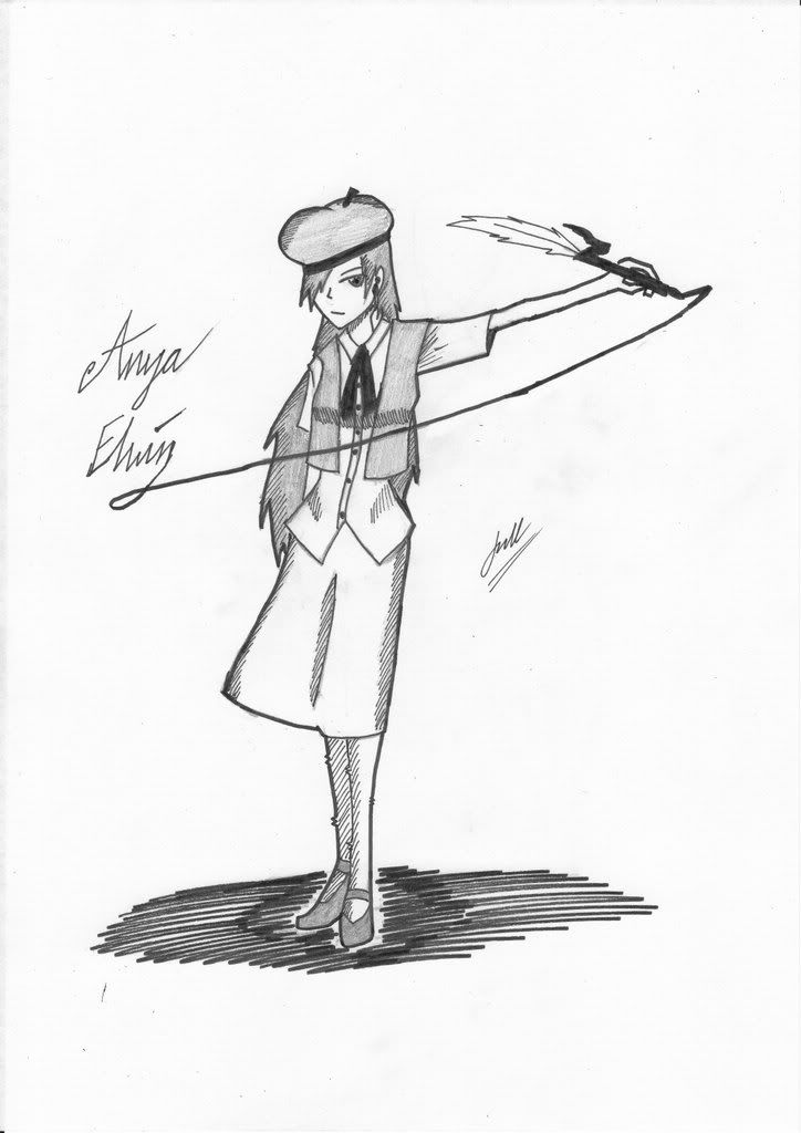 |
|
|
|
Post by HZ on Oct 24, 2008 8:36:19 GMT -5
Very nice, you've been showing alot of improvement lately. Nothing I can really point out, so good work  |
|
|
|
Post by Professor Fann on Oct 24, 2008 8:45:34 GMT -5
Sweet. She looks wonderful.
I think the feather on that ink pen should have a firm outline as well.
|
|
|
|
Post by Albireo on Oct 30, 2008 1:17:51 GMT -5
Well, I don't quite think so, as it's a feather D: And I have a halloween work too, not too halloween-ish, but meh  |
|
|
|
Post by Rhonoc on Oct 30, 2008 2:09:43 GMT -5
It's really nice. Only thing that pops up in my head when I look at the drawing, are the teeth. They are like kind of on the wrong positions. But other than that it looks good for me.
|
|
|
|
Post by Albireo on Oct 30, 2008 4:56:37 GMT -5
Getting the teeth in the right position are hard at that size D:
Too bad I don't have A3... Well, that's good in a way, cos my scanner doesn't take that size D:
|
|
|
|
Post by Professor Fann on Oct 31, 2008 9:54:39 GMT -5
Hmm. Nice try for more detailed faces. It's a good foundation which I believe you can move forward on. Eh ... I have no problem with the rest, as the pants foldedness is rather realistic ... I think. Happy Halloween to all.
|
|
|
|
Post by Albireo on Nov 1, 2008 5:59:19 GMT -5
And here I go and draw something out of the blue... 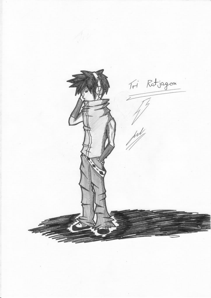 |
|
|
|
Post by HZ on Nov 1, 2008 9:18:31 GMT -5
Very nice, I have to ask, was this one inspired by TWEWY? Because I see alot of smilarities to Neku's design.
Either way, it's a nice peice of art, keep it up.
|
|
|
|
Post by Albireo on Nov 1, 2008 21:21:21 GMT -5
It's actually a redesign of the other Tri I had
And yea... He was made Neku-inspired
|
|